Novelty from familiarity, perfection by contradiction
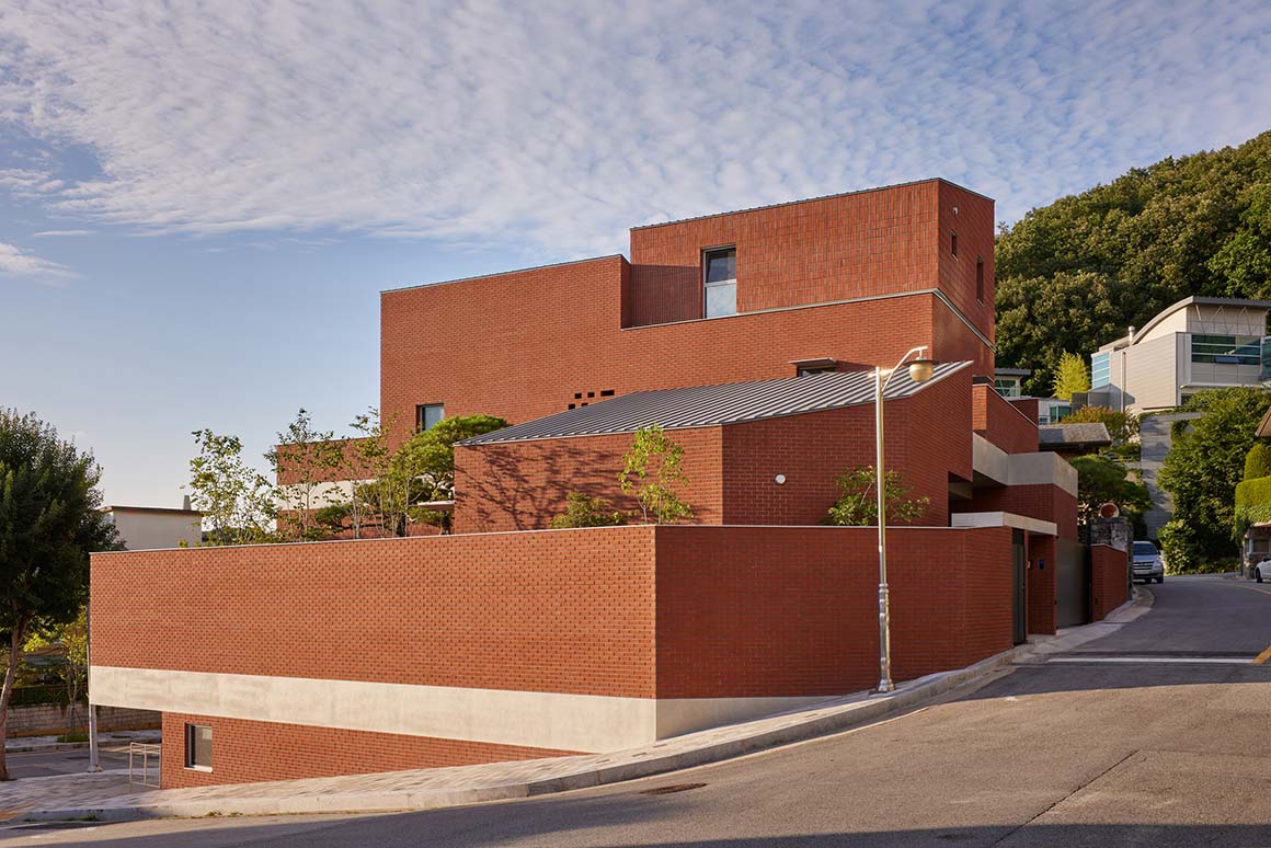
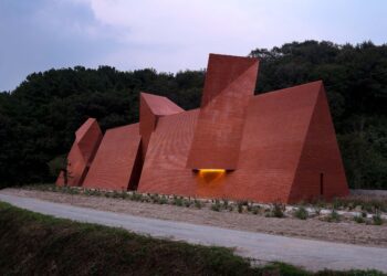
It’s neither too new nor too cliche. It is a red brick house newly built after demolishing an existing old house, walled with bricks that is common not only in the neighborhood but also anywhere in Korea. Most of the neighborhood buildings are built with bricks with a segmented volume and roof shape rather than a single volume. The characteristic elements of these villages are actively adopted. Thanks to this, the house blends in with the surroundings, and the relatively larger volume than the surrounding buildings appears visually smaller.
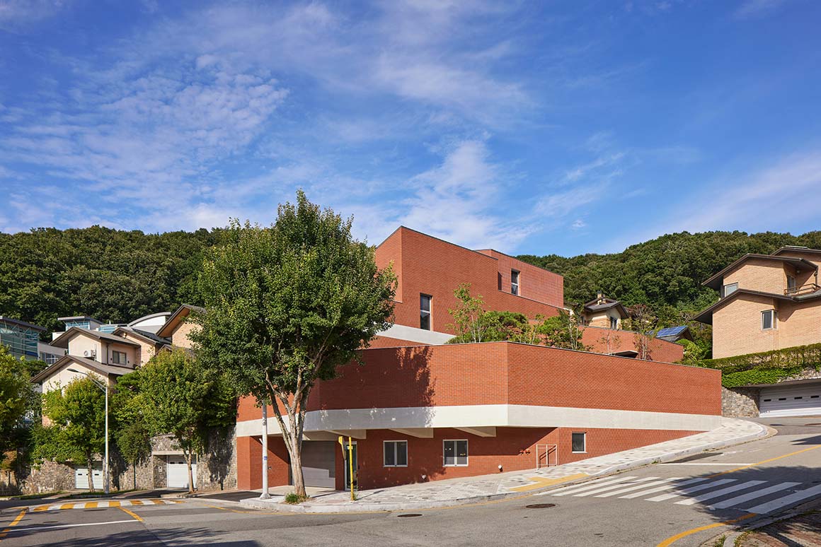
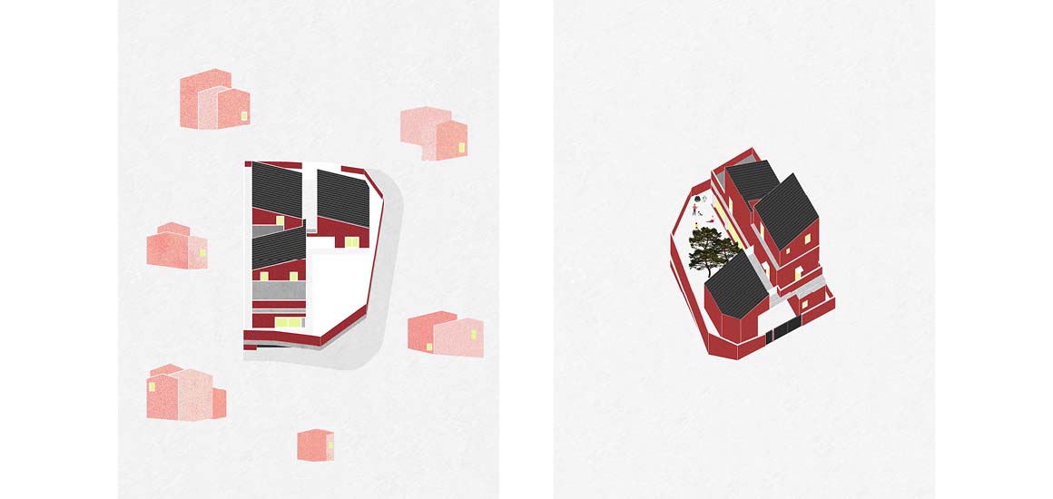
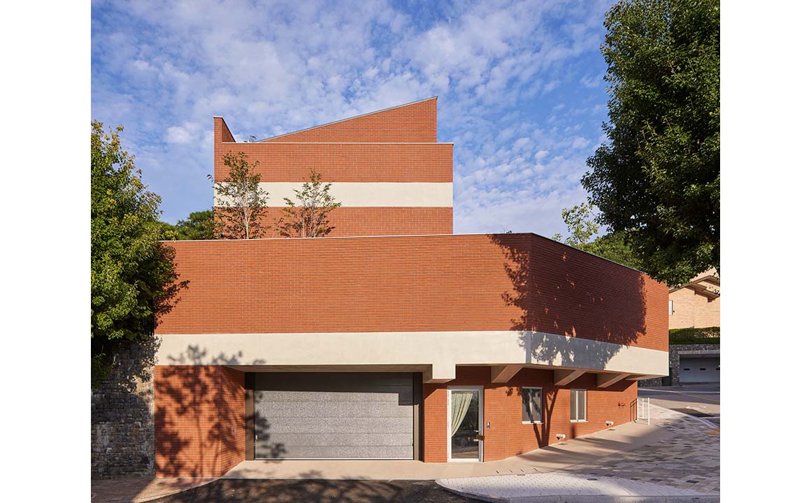
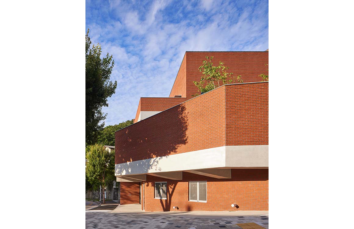
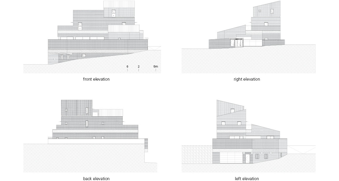
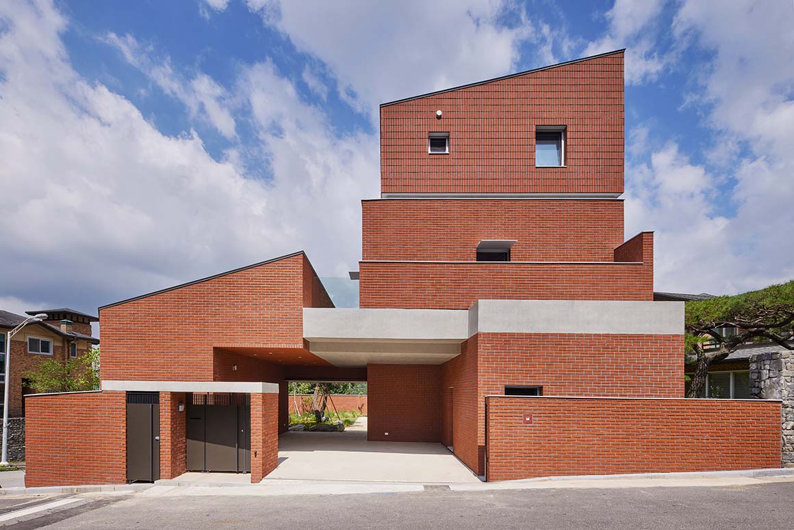
Actually, the house located at the corner was planned larger than the surrounding buildings, composed of 3 stories high with the fence for privacy added. The sloped roof, which is an obligatory element of the district unit plan, is another element that looks voluminous. The volume is divided so that it does not appear larger than the surrounding buildings while securing a sufficient scale. The large volume is divided into smaller volumes, and the third floor is slightly raised from the second floor. The directions of the roof divided into 3 are arranged in different directions again, and it seems to be divided into smaller ones. Each floor is separated by a strip of concrete slabs, which effectively works to reduce the sense of largeness given by the universal single material of red brick. The three different types of masonry are also elements that divide the volume into colorful compositions.
Divisions and divisions are also confirmed in the interior space. A typical example is a pillar with a Korean-style door. Columns of an appropriate size are required to hold a total of four doors, and just as the architectural division offsets the sense of volume, the columns are also divided vertically into four lumps and horizontally with iron bands. Mies van der Rohe’s pillar elements are found in the central iron pillars, Carlo Scarpa’s pillar elements in the way they are joined with wood, and pillar elements seen in traditional Korean cultural assets are found in the iron strips.
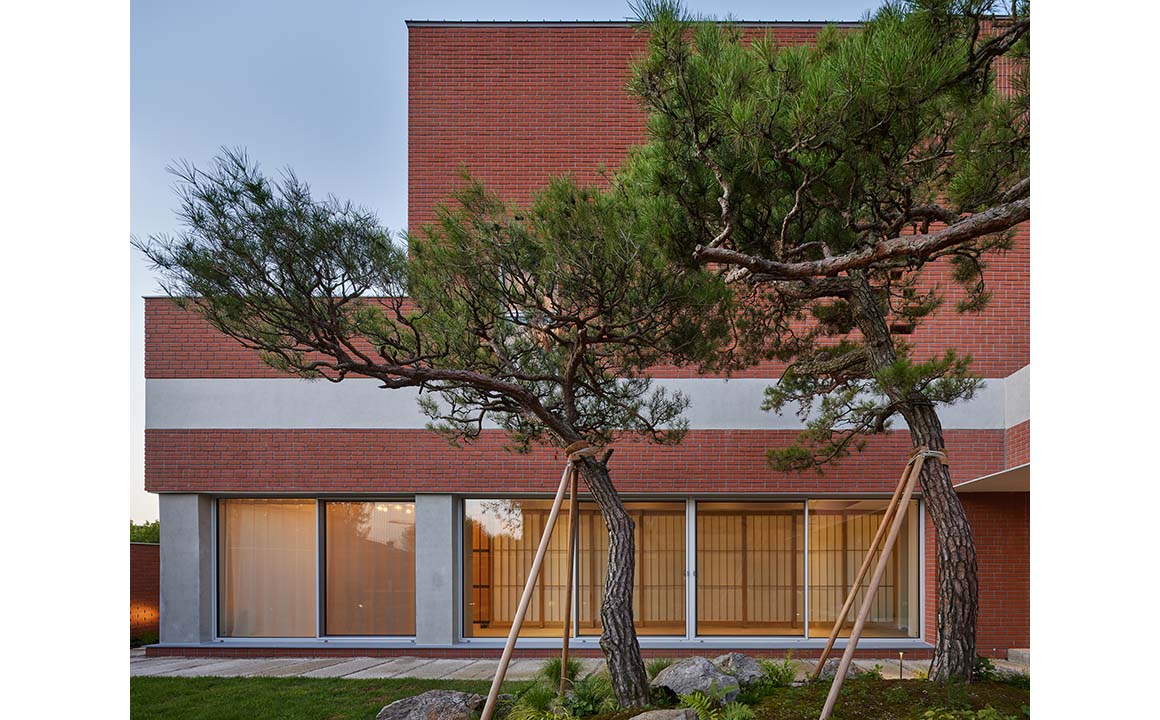
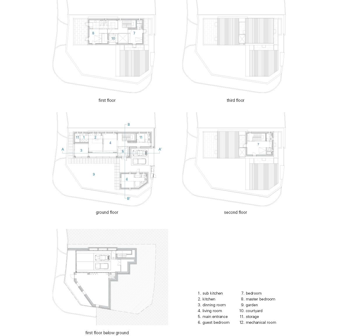
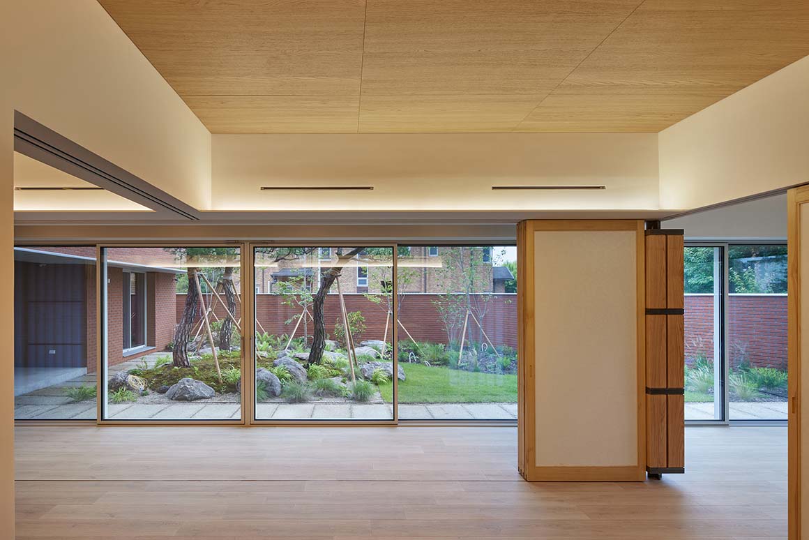

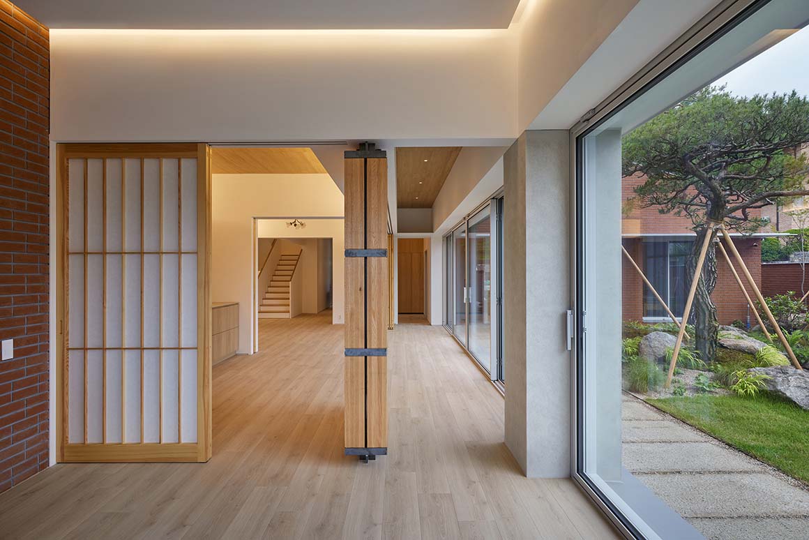


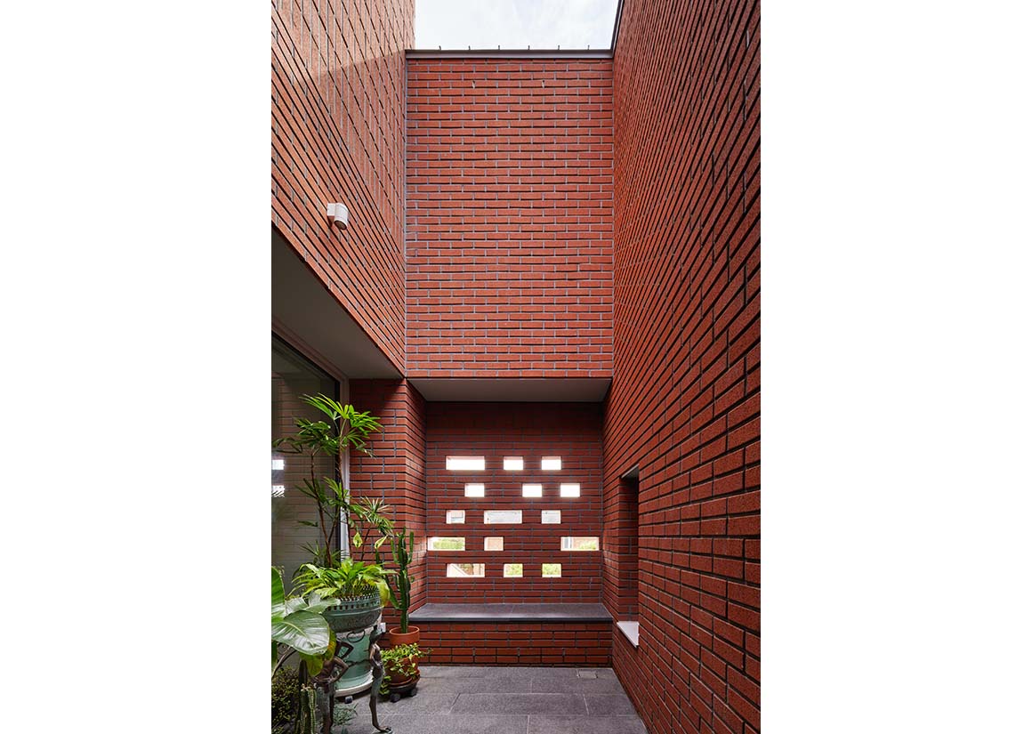
It is also interesting to see that the conflicting elements of visual openness and privacy protection are gathered to enhance the completeness of the space. For the owner’s family who enjoys outdoor life, access to the outside is possible from any point while the private space is clearly protected. The first floor, which is a common space, is partitioned with windows instead of walls so that it can be used flexibly, and when all windows are open, the outside garden is also open. From the second floor, which is a private space, the spatial composition is quite different from that of the first floor. Windows are minimized to reduce exposure to the interior, and most of the windows are hidden by the height of the terrace railing, making them difficult to see from the outside. However, individual terraces are planned for every room, so you can fully feel the sense of openness to the outside. Even in the hallway space, a courtyard is provided to allow ventilation and lighting without windows.
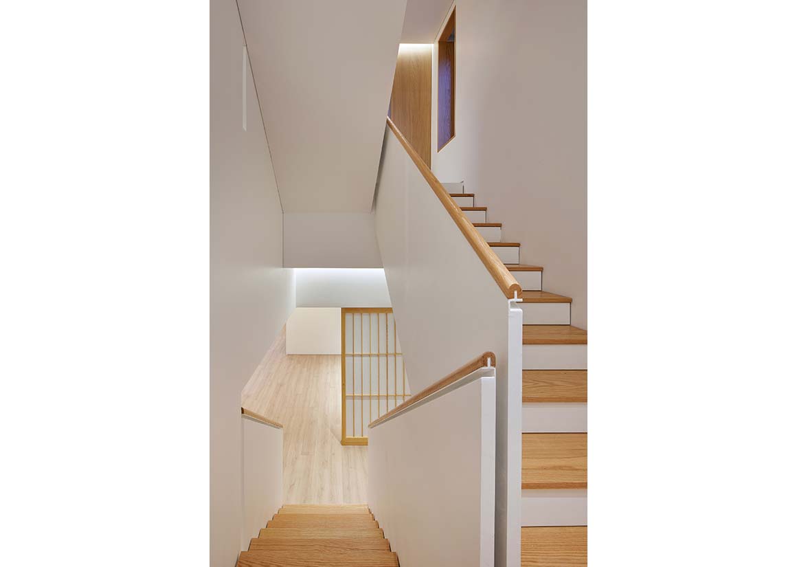
Unlike the outside, there is no disconnection between floors on the inside. The 1st and 2nd floors are physically connected in the void space of the entrance, and the line of sight extends to the 2nd and 3rd floor courtyards. The upper part of the wall between the master bedroom and the bathroom is emptied to create a sense of openness, and the boundary disappears when all doors are opened. It is a form in which spaces are connected vertically and horizontally through empty elements of the interior space.
Project: Jeokhoje / Location: Bundang-gu, Seongnam-si, Gyeonggi-do, Korea / Design: NOMAL / Project team: Minyuk Chai, Bokki Lee, Seyeon Cho / Construction: Jayeon & woori / Structural engineer: The one engineering / Mechanical engineer: Chung lim Mechanical Engineering & Consultant / Telecommunnication equipment: Woo Lim Electrical Emgomeering & Consultant / Civil engineer: Dong In G Tech Co. / Landscape architect: Yeonsudang / Site area: 459.9m² / Bldg. area: 217.42m² / Total floor area: 572.07m² / Bldg. to land ratio: 47.28% / Floor area ratio: 77.25% / Bldg. scale: one story below ground, three stories above ground / Structure: Reinforced concrete / Exterior finishing: Brick, Concrete, 39T glass / Interior finishing: ceiling and wall_paint, white oak; floor_quickstep, stone, tile / Completion: 2022 / Photograph: ©Kyung Noh (courtesy of the architect)


