Representing ‘organic’ philosophy using pinewood, steel, glass and mountain stone
Since the first Choui Fong Tea Café opened in 2015, the Choui Fong plantation has become one of the most famous tourist attractions in Chiang Rai, prompting the need for a second café to accommodate the large number of guests.
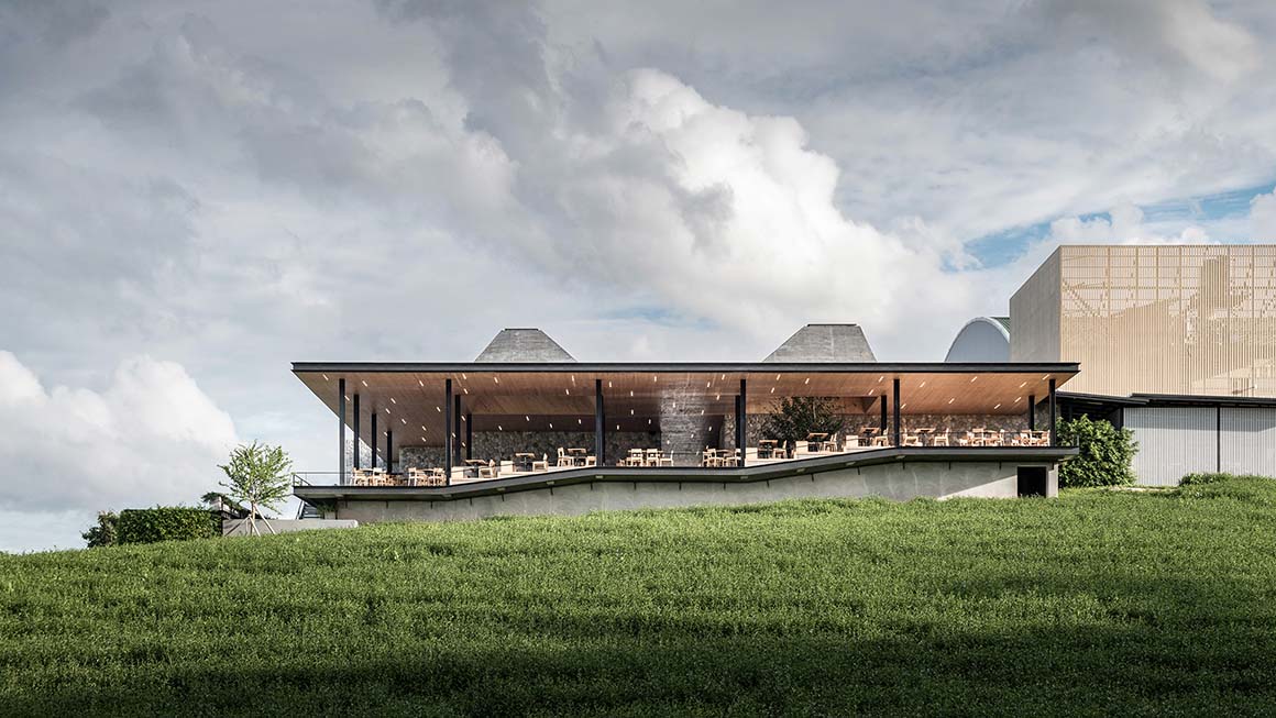
Choui Fong Tea Café 2 is located on the plantation hill, near the first café, replacing a factory and retail area, and enjoying a beautiful view. The project consists of a dining area with 250 seats, a large souvenir shop and the exhibition area where staff demonstrate tea making, and explain the plantation’s history. A significant concern was to ensure a universal design, because family groups with elders are the main clientele of the plantation.
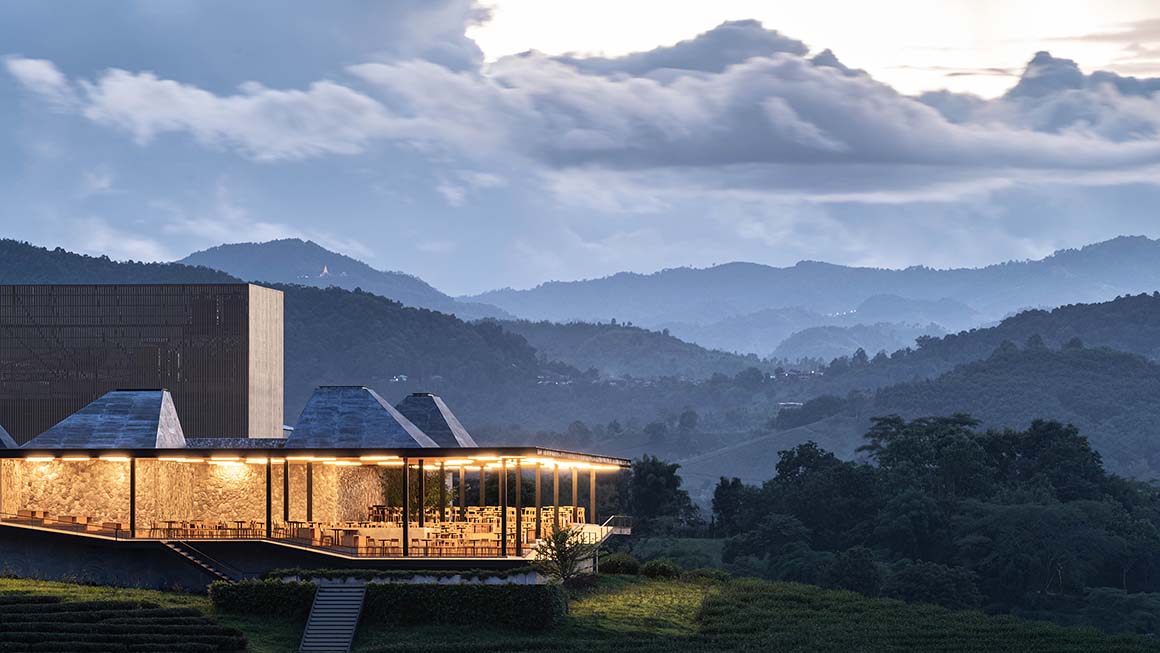
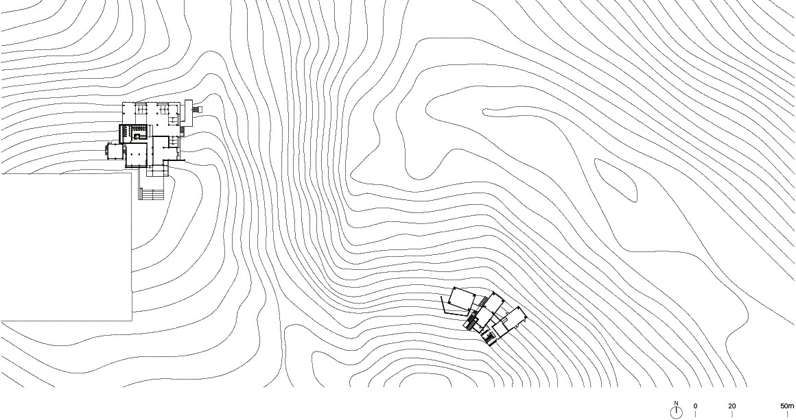

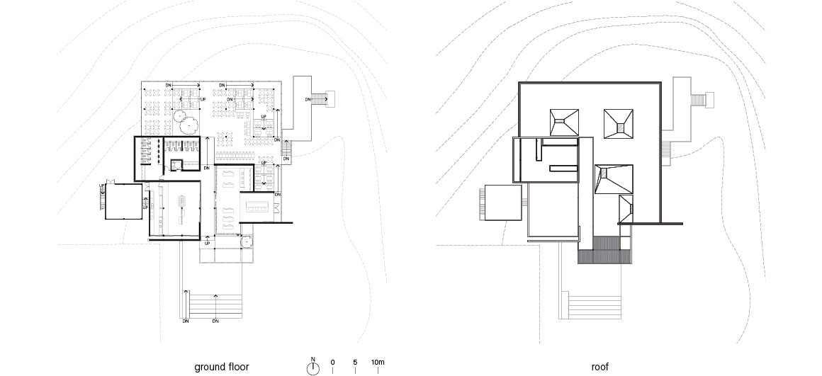
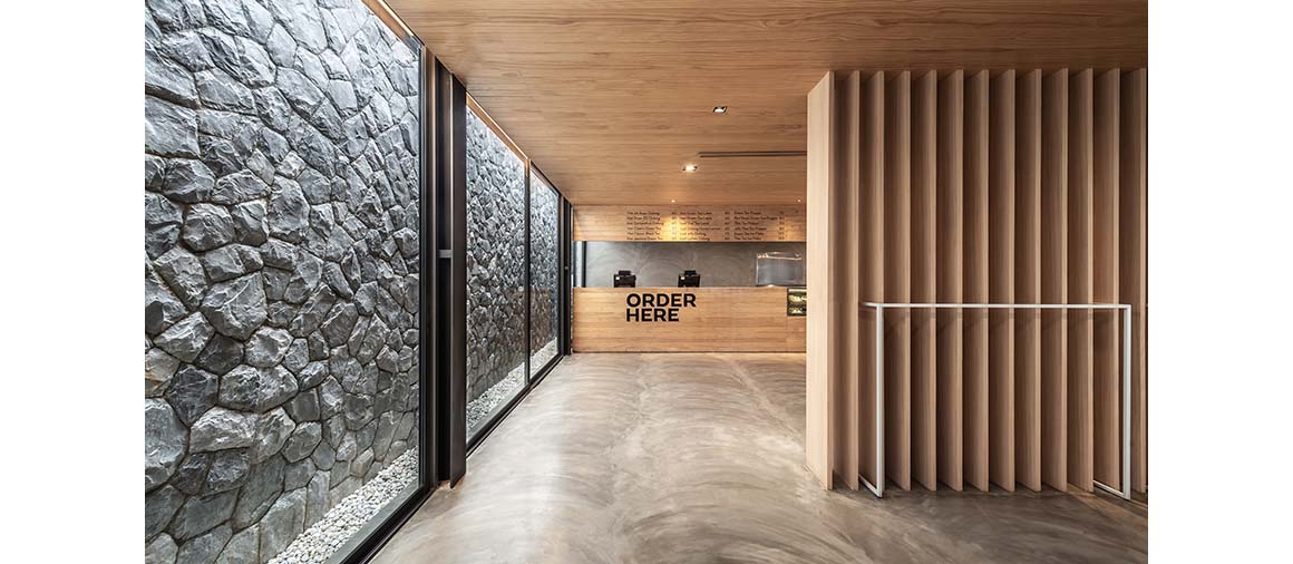
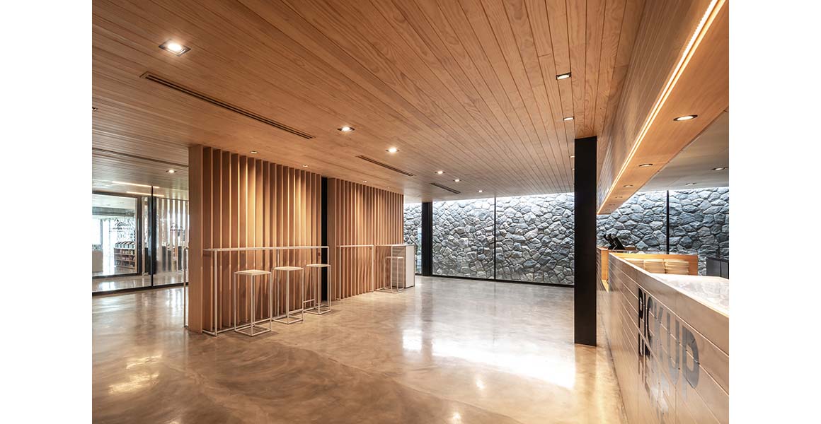
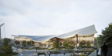
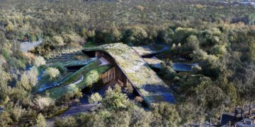
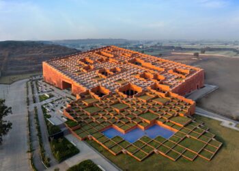
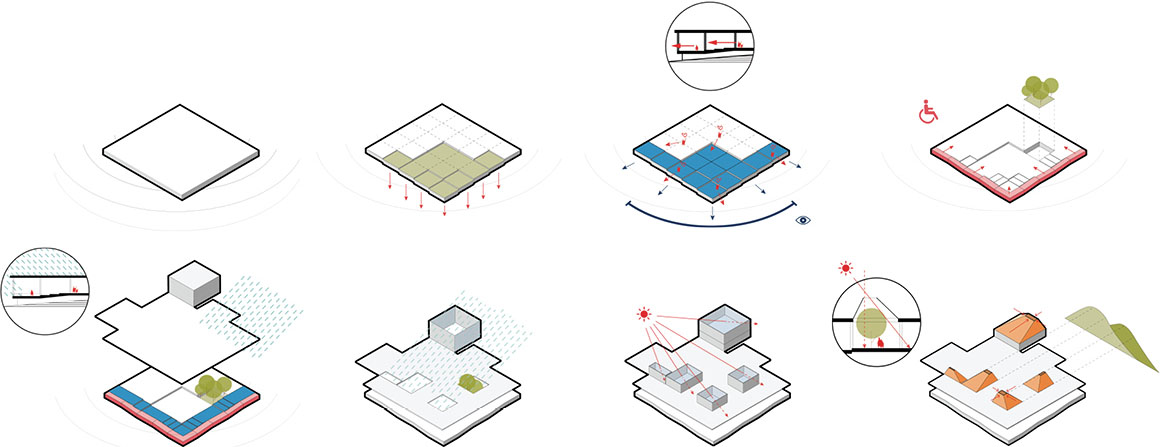
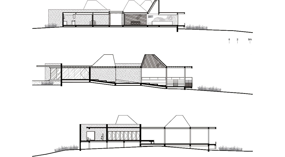
The designers proposed a rectangular shaped floor plan, that allows most areas to face the view. Unlike the first café, which was embedded into the land, allowing visitors to see a panoramic view from its top, the Choui Fong Tea Café 2 stands on the hill to maximize the usable area and be in keeping with the existing factory nearby.
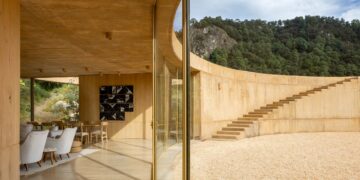
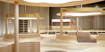
The main concept of the design is to provide visitors with a clear view over the plantation, and be close to the natural surroundings without inconveniencing elderly visitors and disabled people – it should be as accessible as possible. To widen the scenery across the slopes, the dining area is stepped to follow the contours of the land. This allows all customers from every table to see the view at different levels. Moreover, to protect the dining area from heavy rain, intermediary spaces with extended eaves cover the dining area, and under the eaves, a ramp which surrounds the dining area creates accessibility at all levels.
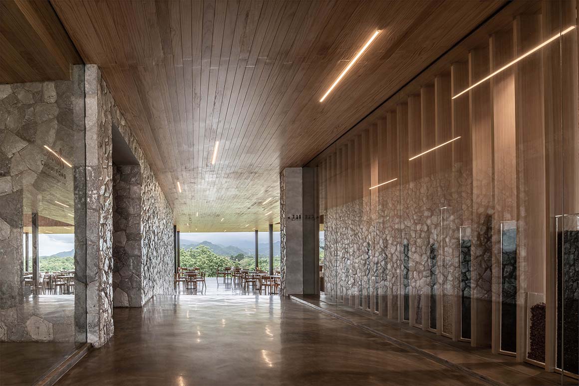
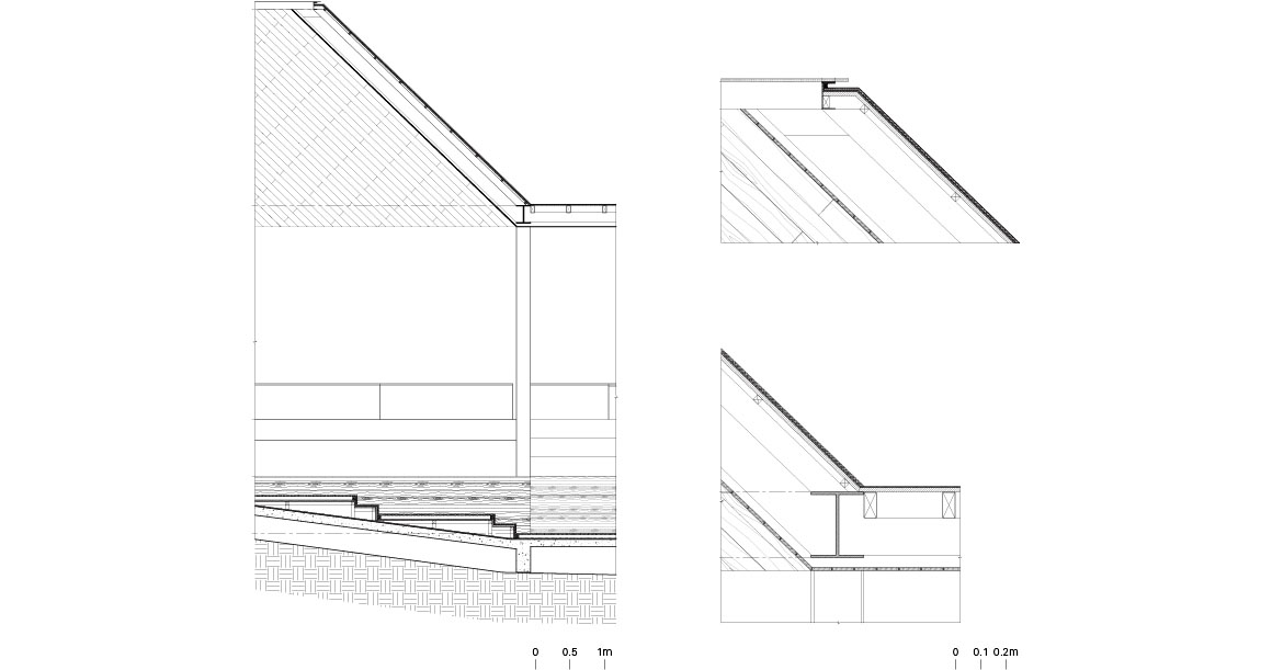
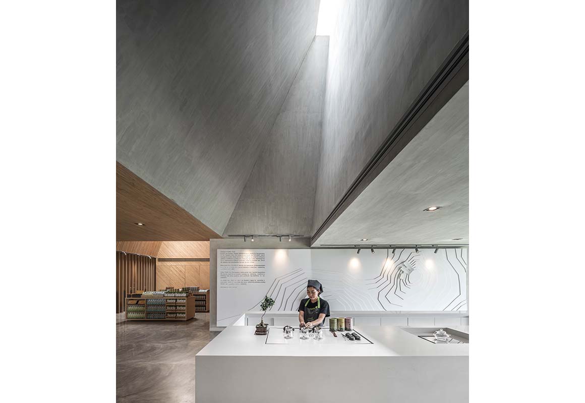
According to the owner’s requirement, which was to maximize the usable area in a one-story building, the floor plane is of enormous size: this usually causes a lack of light within a space due to a deep plan. To counter this, scattering skylights are a feature of the building, which solve the problem of both lighting and maintenance. The skylights are designed with special and unique characteristics, whereby openings are not covered by huge glass planes with many joint structures, but each is extruded and differently distorted into a cone-like shape, more pleasing to the eye. The design has proved cost-effective too. Such cone-like openings also help diffuse light across entire areas, and create light-based patterns at different times in different spots in the interior. The openings’ volume are sufficiently large that trees can be planted underneath them, and the arrangement of the skylights fits harmoniously with the surrounding mountains.
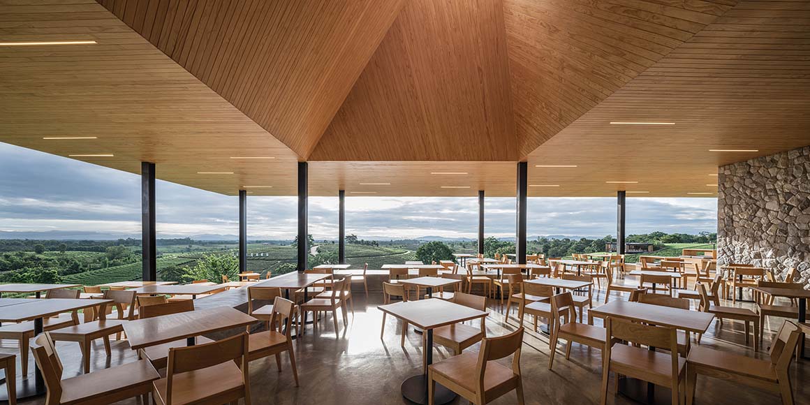
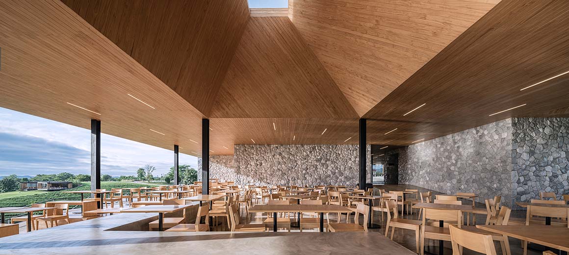
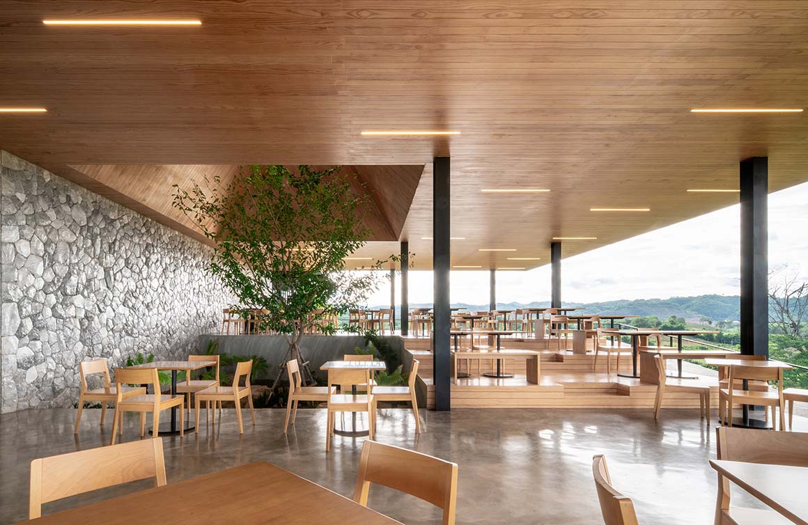
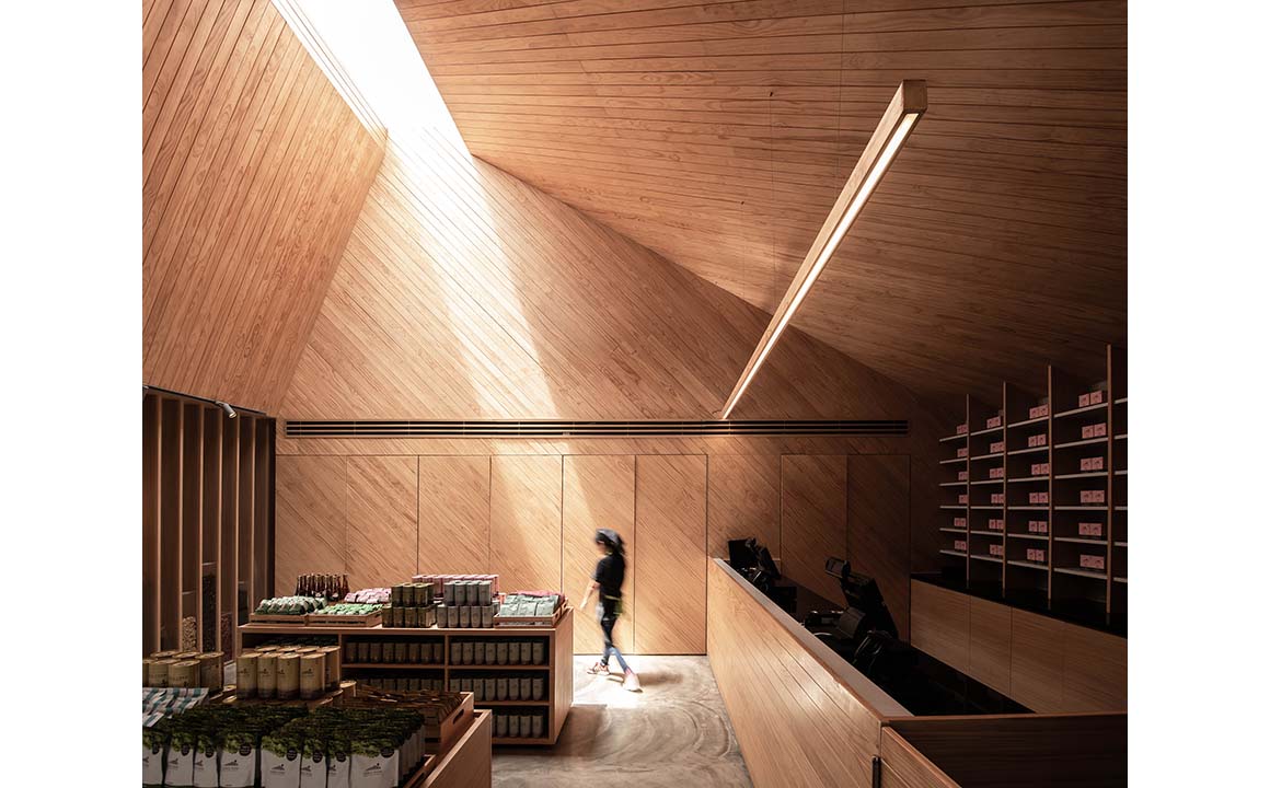
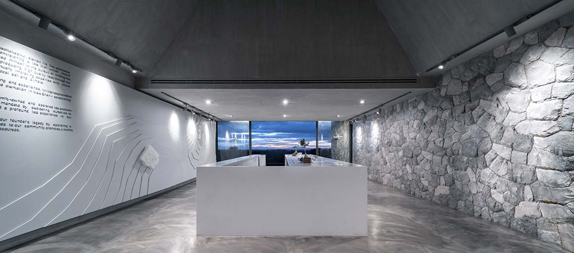
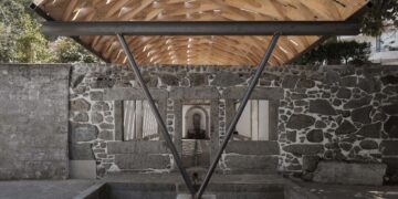
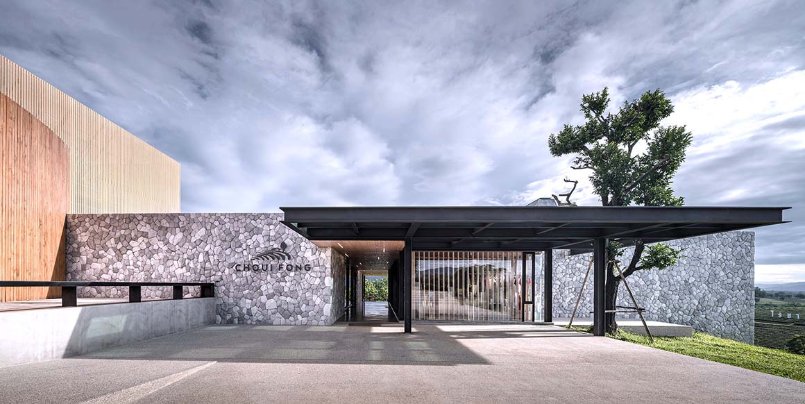
Along the stone wall at the entrance, visitors enter through only a small void, which acts as the wind tunnel that greets the visitors with a welcome breeze. As one moves through this tunnel, the dimly-lit atmosphere is gradually brightened until the dining area is reached, where visitors enjoy their food and the scenery. The materials of the project are harmonious with those of the first café, including pinewood, steel, glass and mountain stone. These materials represent Choui Fong’s philosophy of an organic plantation.
Project: Choui Fong Tea Cafe 2 / Location: Maechan District, Chiang Rai Province, Thailand / Architects: IDIN Architects – Jeravej Hongsakul, Eakgaluk Sirijariyawat, Sakorn Thongdoang, Sittipong Wiriyapanich / Interior architects: IDIN Architects – Jureerat Korvanichakul, Siravich Pienpitak / Structural engineer: Chaiyot Pinitjitrsamut / System engineer: Eakachai Hamhomvong, Panot Kuakoolwong / Contractor: Det Thijina / Client: Shanya Wanasphitaksakul / Area: 1,330m² / Completion: 2018 / Photograph: Depth of Field Co., Ltd

