Adjustable space and light acoustic curtains under a light ceiling
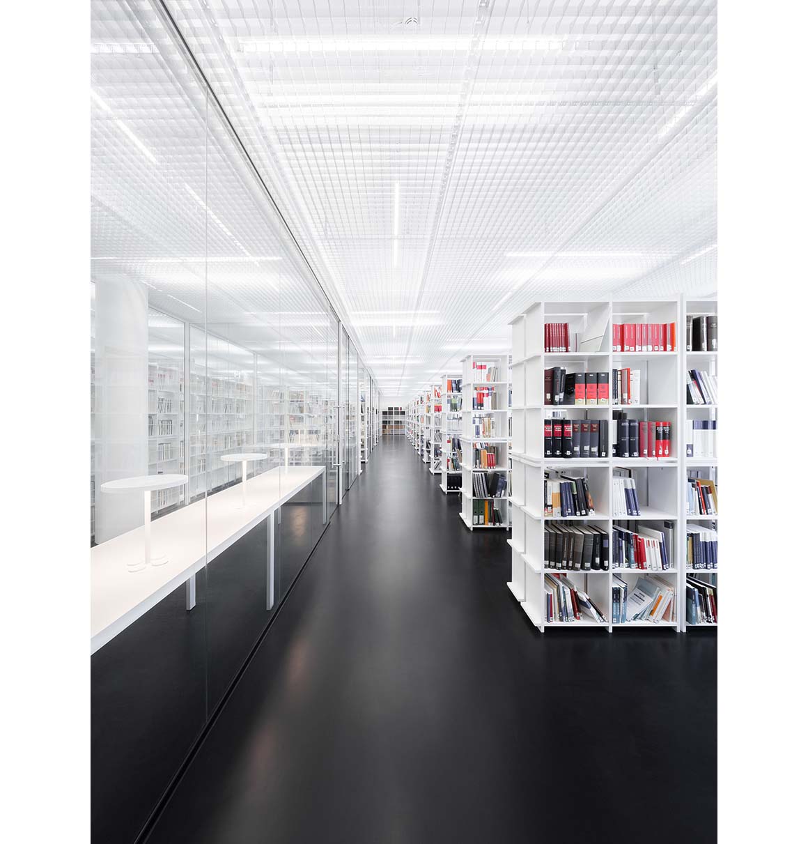
The new library of the University of Applied Sciences for Public Administration in Cologne’s Deutz is designed based on the concepts of order and freedom. The building offers a high degree of adaptability, and considerable transparency within its 700m² plan. With its bright, open and inviting character, it is an attractive flagship of the university, which caters for around 2500 students.
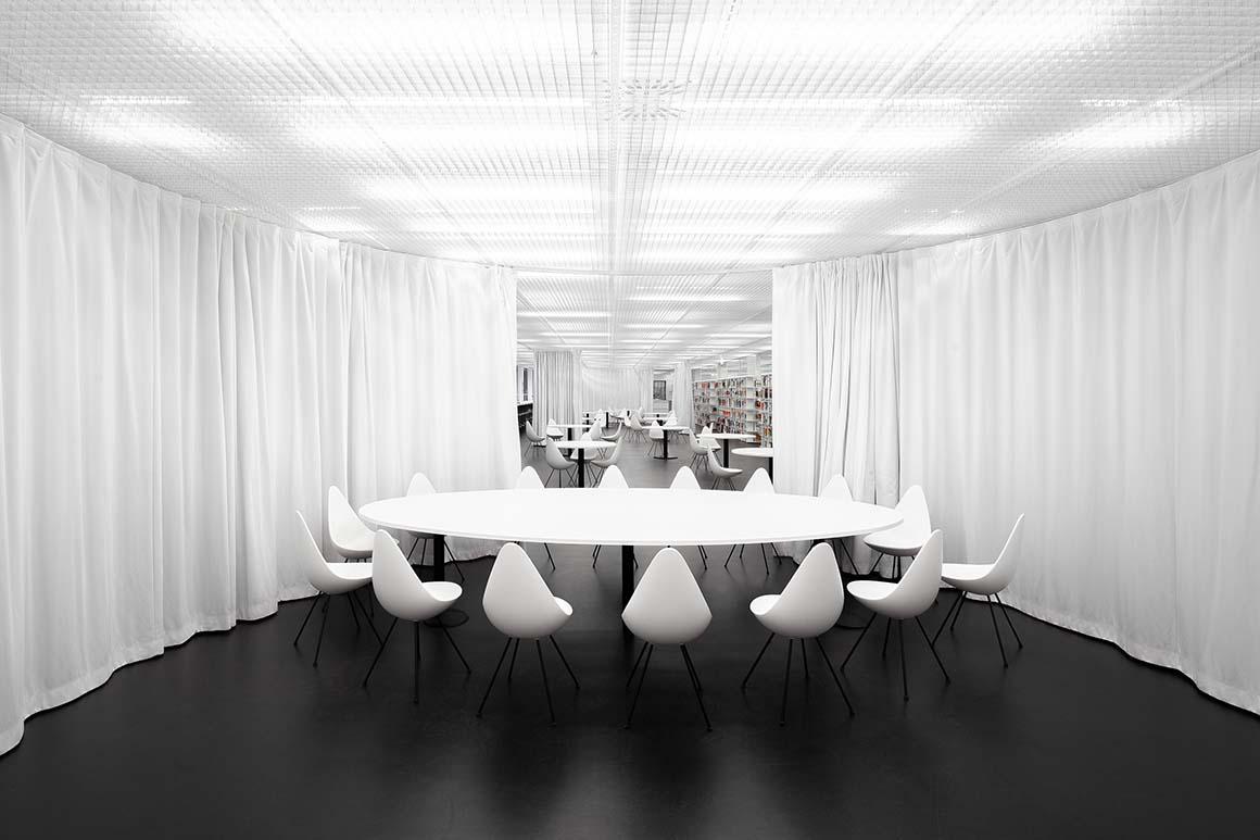
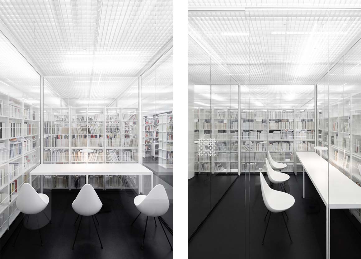
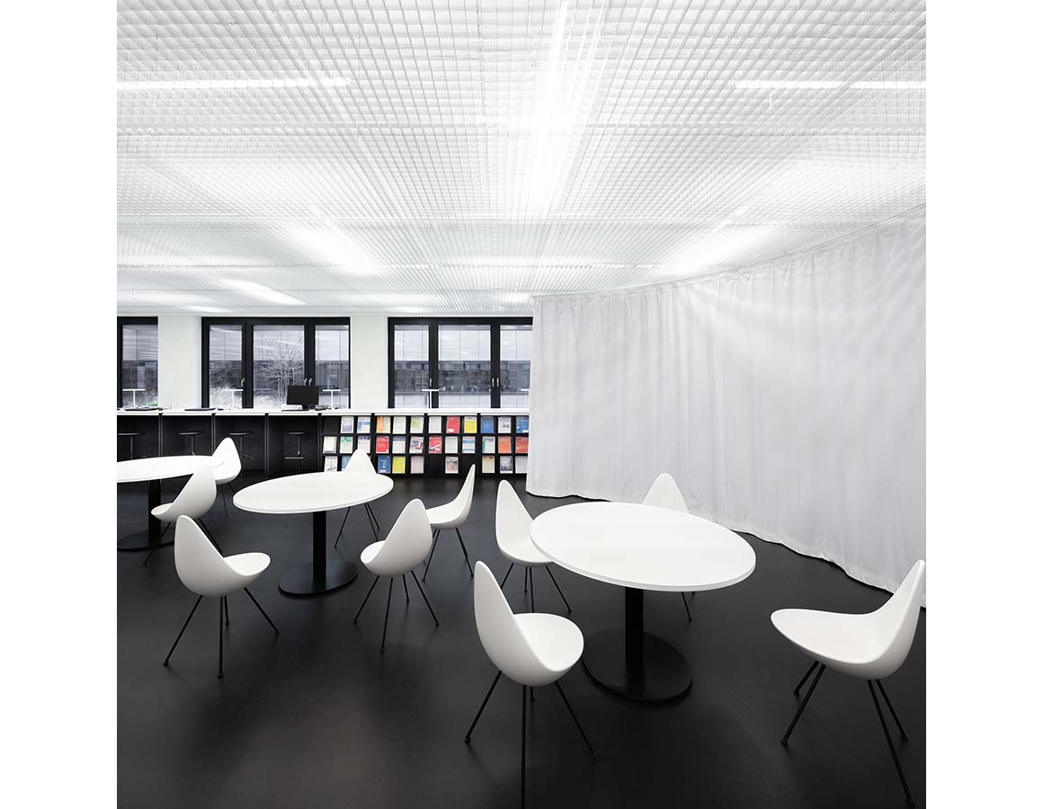
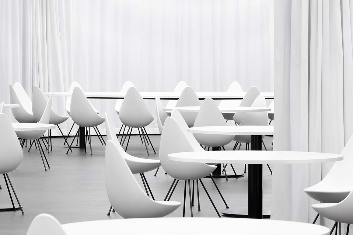
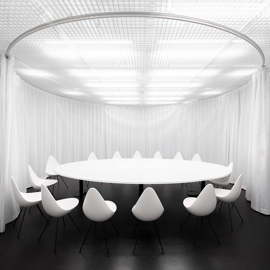
Through the interweaving of highly transparent learning cubes and light acoustic curtains that can be adjusted as required, the library functions as a complex single-room, structured under an apparently limitless, all-connecting light ceiling.
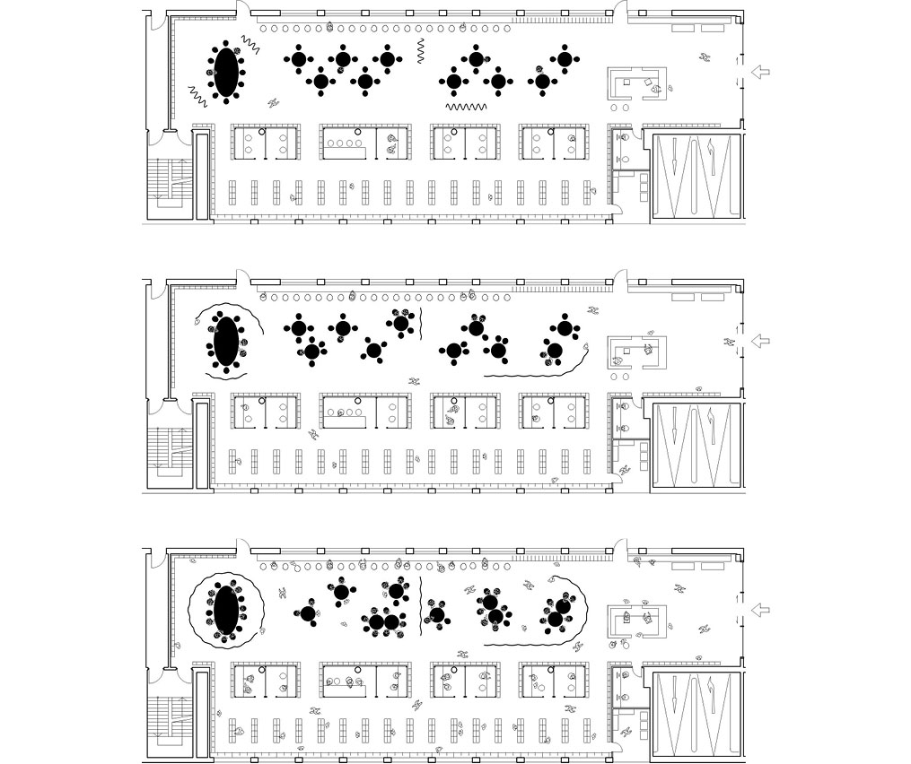
The transitions between the lounge area of the entrance, the administrative counter, the communicative learning landscape in the center, the work counter along the inner courtyard and the study carrels, surrounded by books on three sides, are fluid and overlapping.
Various straight and curved acoustic curtains, based on the “Café Velvet and Silk” designed by Mies van der Rohe and Lilly Reich in 1927, allow the learning landscape to be easily modulated and, if necessary, zoned differently during the semester. At the beginning of the semester, open spaces dominate, but during the busy examination period the curtains offer alternating retreats for different learning groups.
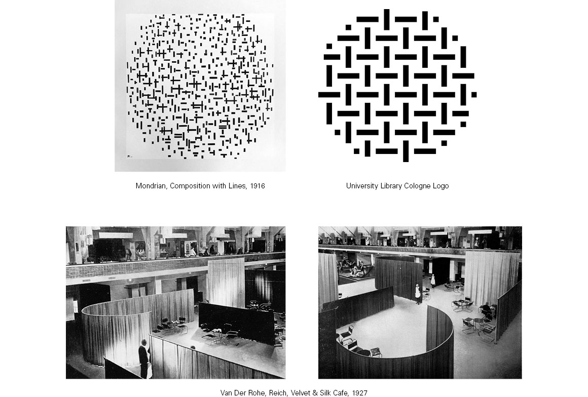
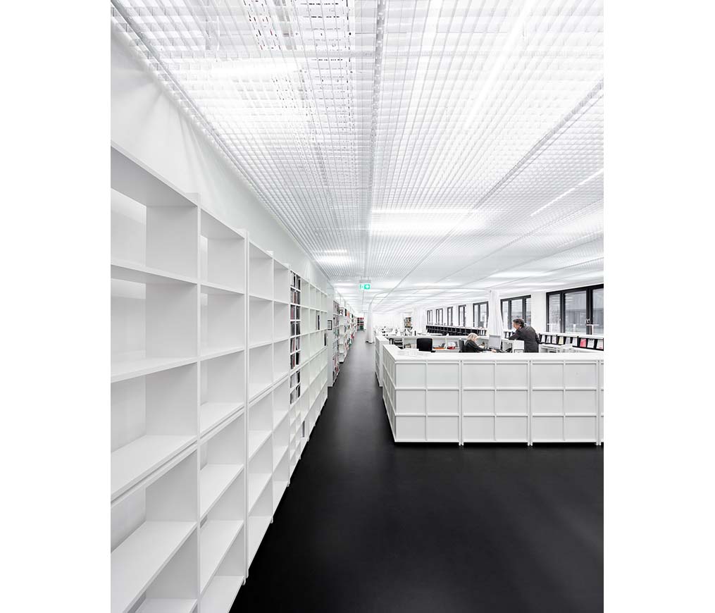
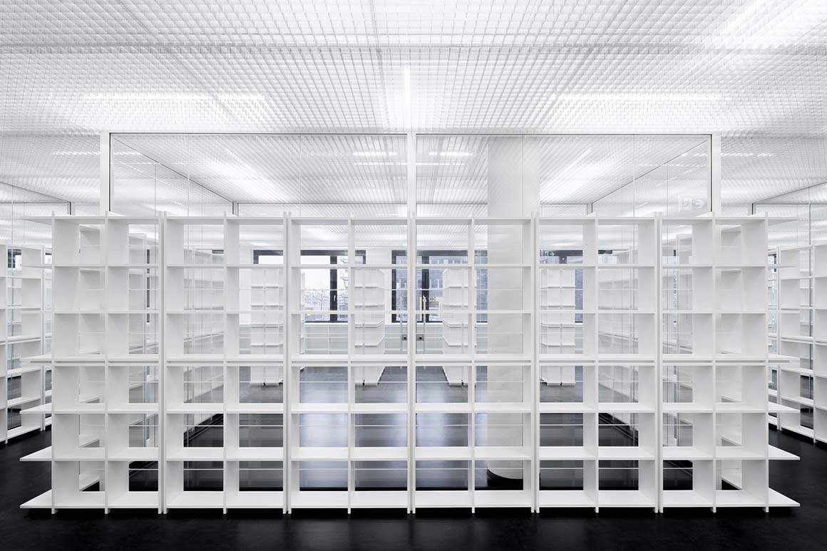
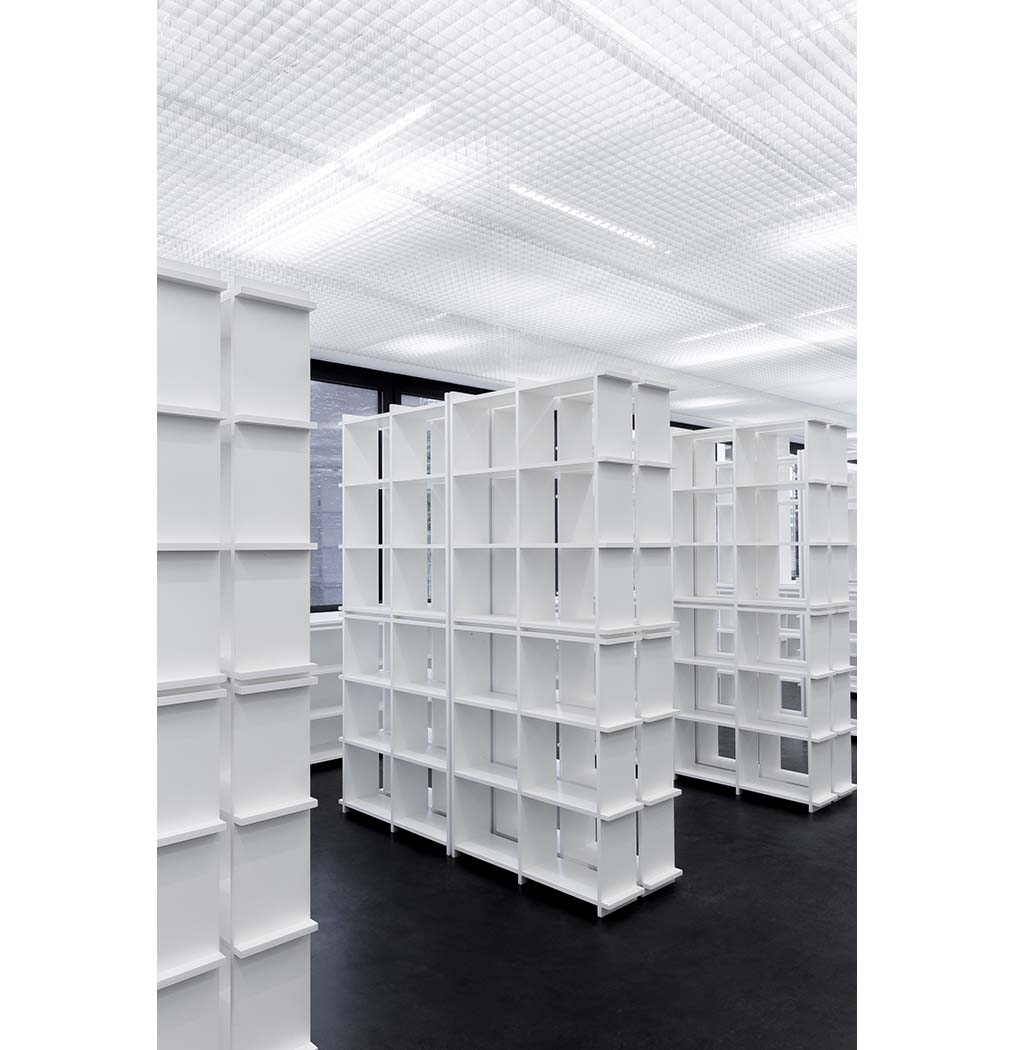
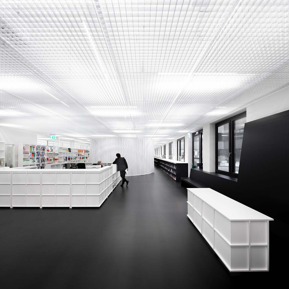
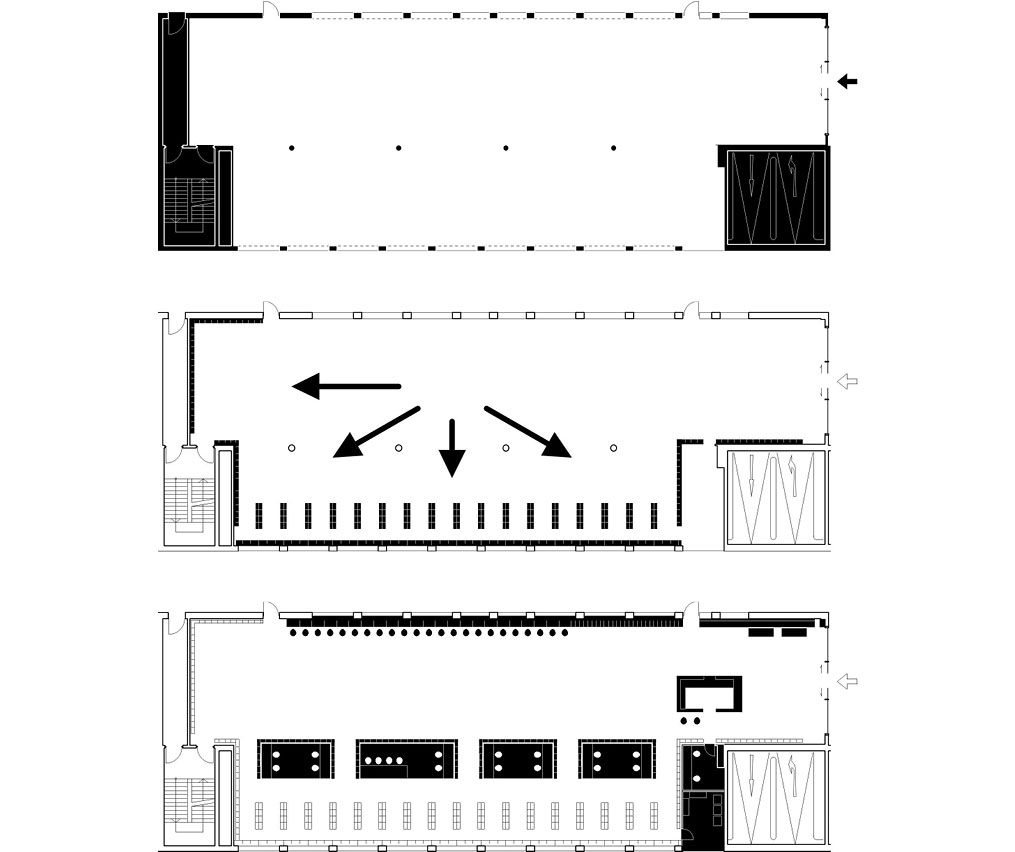
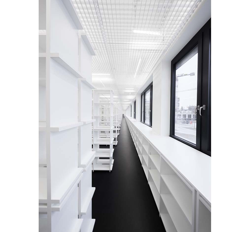
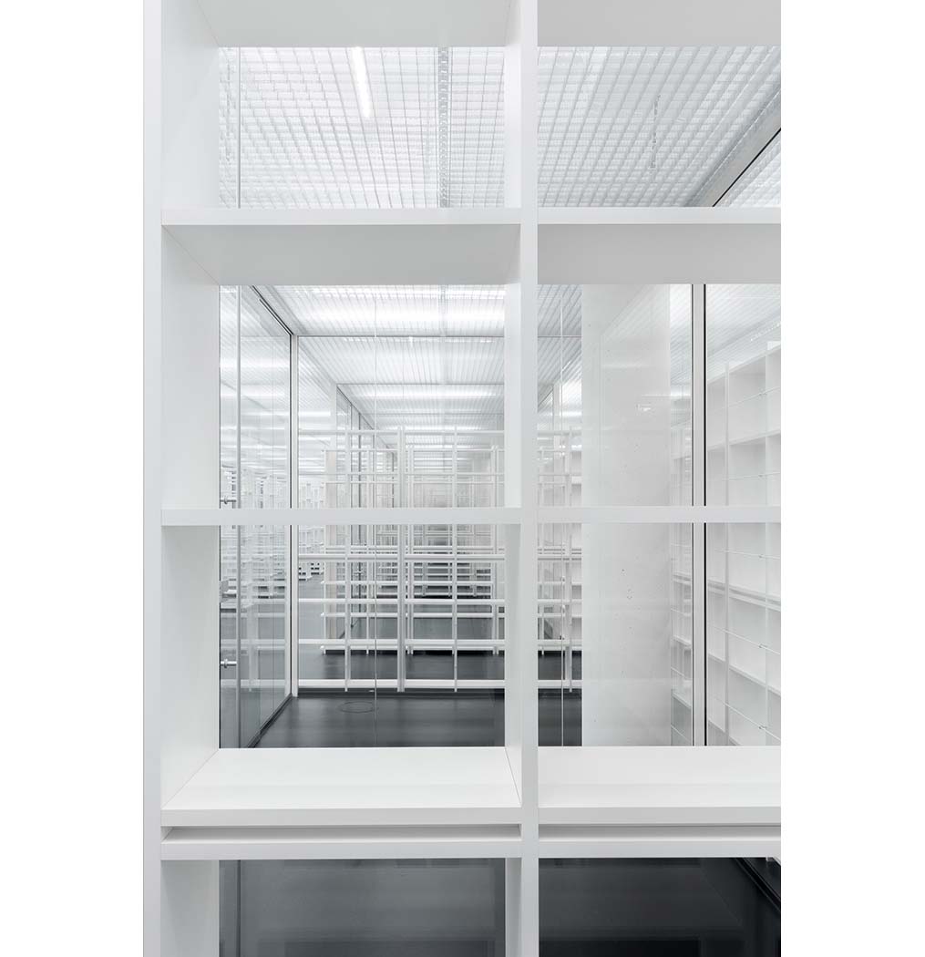
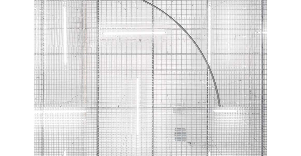
The theme of a merging grid, as found, for example, in Piet Mondrian’s paintings, is translated into the third dimension by shelves and ceiling. The openly woven structure of the grid ceiling, made of high-quality anodized aluminum, with a level above the ceiling of a network of the necessary but almost invisible house technology, picks up on this design theme and, together with the lighting, generates a wide variety of reflections.
Within the semi-transparent glass study carrels this game of sightlines and outlooks, reflections in the glass and the gridded shelves is continued in more introverted areas.
In this way, the library not only manages to realize all functional requirements in an atmospheric manner, but also, embracing the concept of freedom and order, to represent the teaching content of the university, which primarily trains police officers and administrators.
In the words of site manager Holger Nimtz, “The library is the jewel of the new building.”
Project: University library FHöV Cologne / Location: Cologne, Germany / Architect: Andreas Schüring Architekten BDA / Lead architect: Andreas Schüring / Co architect: Jan Jonas Kunz / Client: Fachhochschule für öffentliche Verwaltung NRW, Köln / Use: library / Floor area: 700m² / Completion: 2019 / Photograph: ©Andreas Schüring Architekten BDA (courtesy of the architect)

